The Hidden Gotcha of Default VStack Spacing
Last week, my colleague and I were working on a new feature. We decided to deliver most of it in UIKit, but with a little SwiftUI splashed-in.
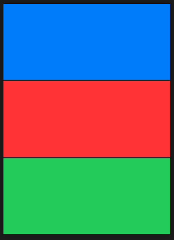
The design wanted a few elements arranged vertically to be flush next to one another, no gaps, nothing. Using a VStack to arrange our elements resulted in gaps as depicted by the horizontal black lines. Odd. We’d not set any padding on any of the elements, so what gives!

Turns out, VStack applies a little spacing by default, which you can disabled by adding spacing: 0 to the initializer for your VStack (see line 3):
struct Stax: View {
    var body: some View {
        VStack(spacing: 0) {
            Rectangle()
                .foregroundColor(.blue)

            Rectangle()
                .foregroundColor(.red)

            Rectangle()
                .foregroundColor(.green)
        }
    }
}
That’ll close the gaps and give you this:
